
Tips & tricks
The Art of Choosing a Background Color
aka color theory for competitive gamers
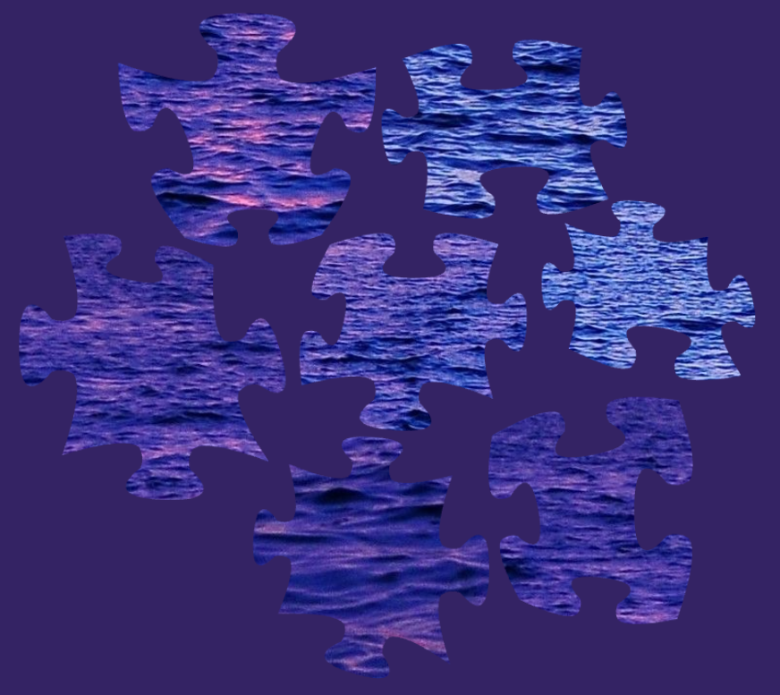
When I was first making this game, I thought that all my puzzling problems were solved. Finally, I didn't have to worry about the size of my dining table because you know what? The digital table is infinite. I also would never lose a piece again. And then the lighting situation... too bright... too dark... too reflective... nah, now everything was finally just right. I lived this fantasy for a while until a player sent me a link to a game with A MISSING PIECE. ARE YOU SERIOUS? Luckily, we found and fixed that bug. I only took a few points of psychic damage.
So let's talk about the lighting situation, and specifically how to get the most out of a changeable background color.
The first basic trick for helping your eyes and brain find what you're looking for is to introduce some contrast. By "contrast" I mean picking a color that makes what you're looking for obvious, usually by being different. For example if we were looking for white pieces, changing the background to black would make the white pieces super obvious.
However, contrast can be a tricky partner. There very much is such a thing as too much contrast. So we may find ourselves picking a background color that feels like it really works for us, and then getting stuck after awhile. This is perfectly natural, and it just means that the background we picked was good for finding some pieces, but might be blinding us to others.
In fact, though counterintuitive, one of the best tricks to give us relevant contrast is to pick a color that is very much present in the pieces we're looking at. I've prepared an interactive animation to illustrate the point. Here we have a very typical situation where we're playing some classic painting and all the remaining pieces are looking REAL SIMILAR. They're all just kinda dark.
Watch (or click and move the slider yourself) and see how they look against a white background. Sure, the pieces pop, but we're totally blind to their interior details. As we move to a black background we can see a lot better. Black is certainly a better background than white while interacting with these pieces. However...their real secrets don't appear until we make the background dark brown or a dark olive color. A dark brown background lets us ignore the brown pieces and makes us very aware of the green foliage. Meanwhile a dark green background lets us ignore the foliage and makes us very aware of the earthy mud pieces. This is how we can approach hard puzzles that have only subtle color variety.
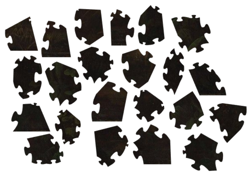
So what's my overall advice? Well keep changing the background color to whatever works for you. If you feel stuck, change it! And what do I recommend changing it to? Well at first go a bit higher on the contrast until you've done the bulk of the puzzle. And then as you get to the hardest pieces, pick background colors that are actually quite similar (maybe a tiny bit darker) to what you're looking for.
Share what you find
The new version of the game also has a really fun feature, which is that people can share their background color. I'm sorry to keep teasing features that I haven't released but it is coming soon™️. So if you find something illuminating, don't hesitate to share!
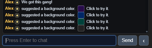
Also, when you try someone's suggested color the game will remember your previous color so you can go right back to it in the color picker if you have regrets. There's also a preview of the color available if you hold your mouse over it in the chat 😉.